
Chinese consumers are immersed in a unique ecosystem of apps and HMI (Human-Machine Interface) systems. This shapes their perspectives and usage habits.
In our upcoming article series, we will take a deep dive into various popular Chinese apps and HMIs, such as Gaode Map, Baidu Map, and modern car HMI systems. We will analyze these systems from UI and UX perspectives, while also providing cultural background and insights.
Follow us on LinkedIn to stay updated.
The landing page
In car navigation systems, especially from the German car brands, are barely used by the chinses users. We published an analyzing article about this in the past regarding the core user needs when it comes to a navi app ( link ) .
If you have read another article from us regarding whether an intuitive system really exist ( link ), you might agree people like the system with which they are familiar to.
In this article, we are going to analyse the mostly used navi apps in China: Gaode map and Baidu map, comparing them to Google map from UI and UX perspectives.
Let us start with the landing page.
Wireframe first impression
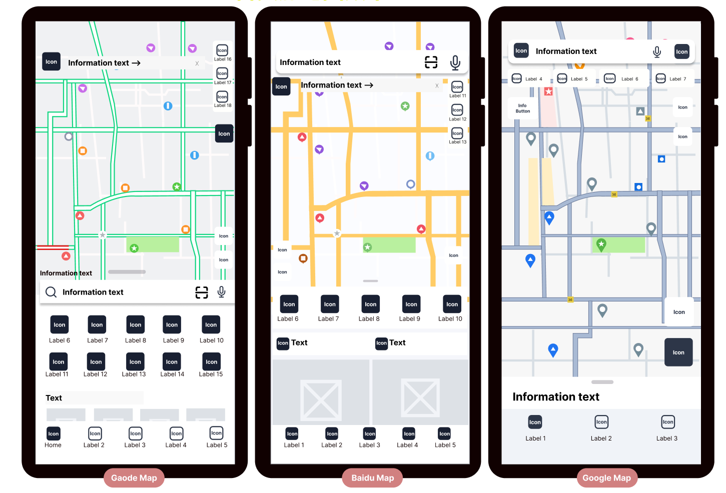
The first image shows the default mode after entering the app (P01-01):
Please note: Chinese apps have a very high iteration frequency, so the design may differ by the time you read this article.
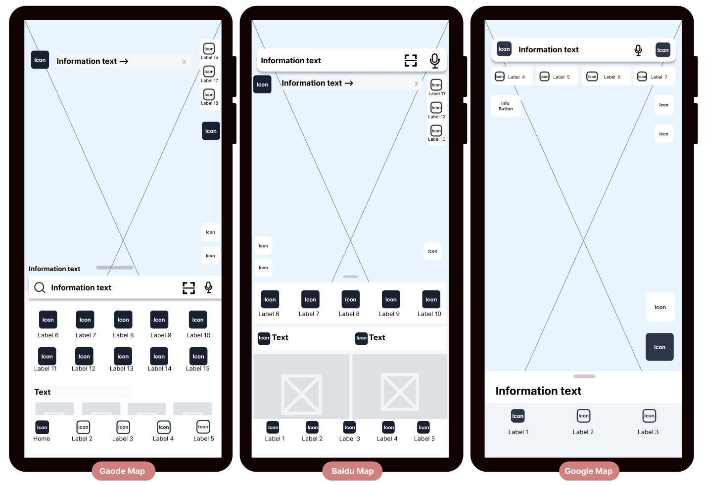
P01-01 Gaode map has clustered areas, google map is the most streamlined.
Google map app is the most streamlined, displaying the fewest icons/features while maximizing the map area, allowing users to quickly grasp the essentials.
Gaode map groups the features, such as search function, menu, and other features at the bottom, creating a clear division between the upper and lower sections of the screen. The similar size of the icons gives it an orderly appearance.
Both Gaode Map and Baidu Map App offer more features on the homepage than Google. (Please note: during our research, we noticed that the software updates every two weeks, and the number of icons on the homepage has been decreasing. )
At the same time, displaying functions on the homepage has its advantages, as it helps users become more familiar with the system's services and makes it easier to access features.
Insights from Spiegel Institut:
- Chinese consumers prefer products that offer more features, regardless of whether they use them.
- They believe that the product should provide enough/many features for convenience when needed.
Additional Display Mode
Gaode Map and Baidu Map App both offer a full-screen mode when tapping the map (see P01-02):
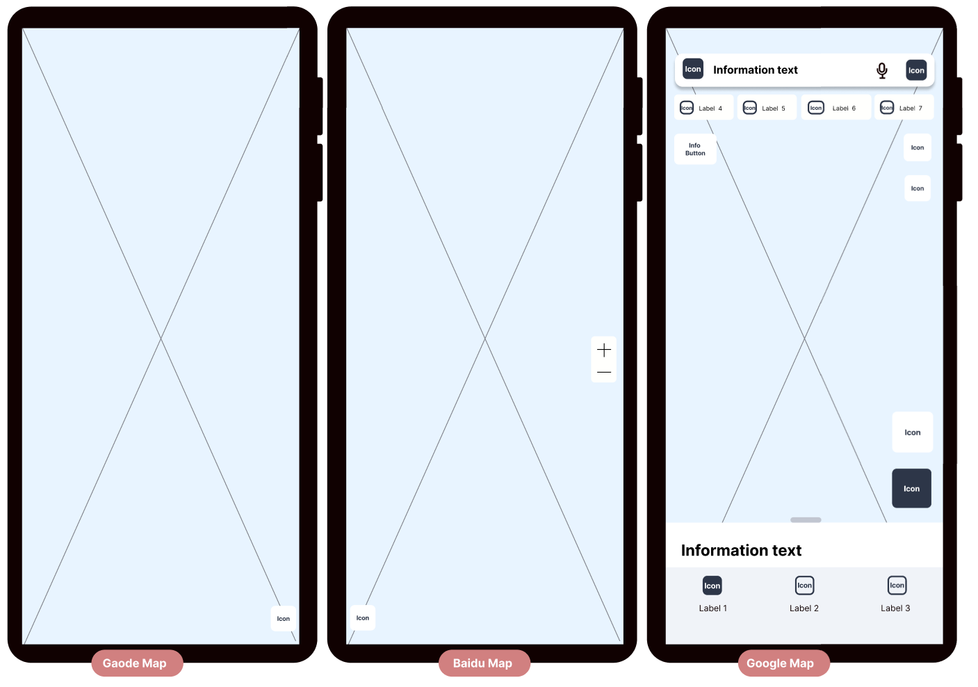
P01-02 Gaode and Baidu Map Apps offer full screen modes
- All menus and functions disappear
- Only the "Current Location" button remains at the bottom of the screen
- Baidu Map App automatically displays zoom in/out buttons in the middle right of the screen
Tapping the screen again returns the page to the simplified mode. Pulling down the drag bar on the homepage also switches to this mode. For a detailed introduction of specific features, please refer to our upcoming articles.
Design of the map elements
Although Google Map App's wireframe appears very simple at first glance, once the map is added, the overall layout loses much of its clean look.
The reasons are as follows:
1. Gaode Map and BaiDu Map App have a strong accent color for their main roads by default (see P01-03).
- Gaode Map App displays traffic conditions by default, showing green (smooth traffic), yellow (congestion), and red (heavy congestion).
- Baidu App's default main road color is yellow.
- The main road colors in Gaode Map and BaiDu Map App contrast strongly with the gray of the map.
- Google Map App's dark gray color contrasts less with the gray of the map.
2. The secondary street colors (see P01-03):
- In Gaode Map and BaiDu Map App, the secondary streets are white, which has a low contrast with the map's gray, so the roads don't draw attention.
- Google Map App uses light gray for secondary streets, which shares the same hue as the main roads and the map itself, resulting in very low contrast.
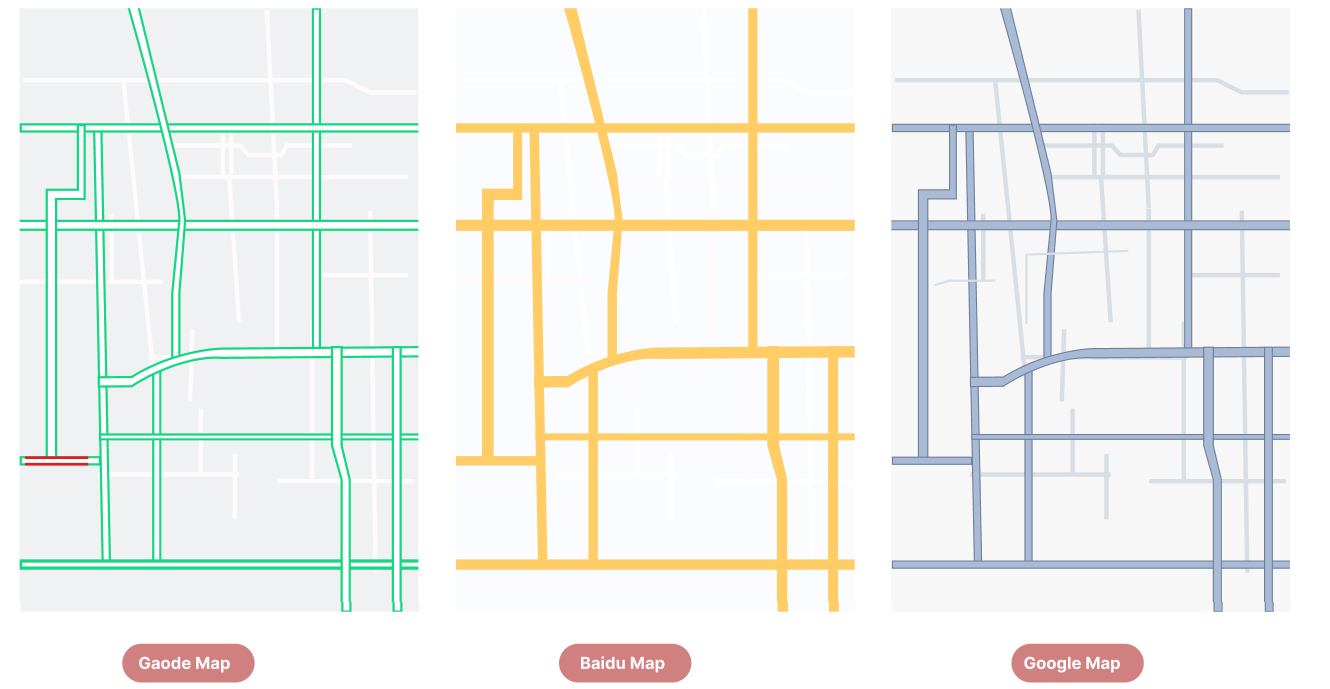
P01-03 Gaode and Baidu Map have very strong accent color for the main roads, and the secondary roads are almost invisible
3. The icons (see P01-04)
- in Gaode Map and BaiDu Map App are all circular or nearly circular, creating uniformity in shape.
- Google Map App's icons come in various shapes and sizes, lacking visual consistency. Additionally, the teardrop-shaped icons can be visually jarring, making it difficult to achieve a clean appearance.
4. Gaode Map and BaiDu Map App only mark green spaces and water (in blue and green), while Google Map App also marks yellow and red areas, adding more color blocks to the screen (see P01-04)
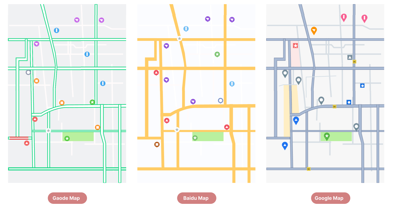
P01-04 Gaode and Baidu Maps have icons in uniformed shapes, Google has more big color blocks
When we add map details to the wireframe, we can see that the simplicity of Google Map App's wireframe is significantly diminished (see P01-05)
Conclusion
We must admit that, in the end, none of the apps truly appears streamlined to us.
Gaode and Baidu maps lose points due to the many functions displayed on the landing page, while Google map loses points because of its map element designs.
Studies show that Chinese consumers prefer simple, uncomplicated design and very quick access to functions—both of which are especially important while driving.
Spiegel Institut offers full package services for HMI and operation system development as well as usability tests for all industries. Feel free to contact us for cooperation: info@spiegel-institut.de